Double hit |
 |
| Conor Clarke reports on the ICAD presentation given by Declan and Garech Stone, aka The Stone Twins |
The Stone Twins star has been rising ever since their first presentation to a Dublin audience at the Guinness Storehouse in 2001. Despite three years apart, marked by separate stints in BBH New York and 180 Amsterdam, wit and ideas still drive this Amsterdam-based Irish duo and their eclectic body of advertising and design.
For the Stones, branding is not about a natty little logo and sticking it top right or top left on a letterhead. With Usual Suspects (see home page image), an experiential marketing agency, photographer Krijn van Noordwijk created portraits where staff members were bound and gagged with specially-designed packaging tape. The tape became the brand, stuck on everything from letterheads to staff members.
The approach worked for SoundCircus ad tracks and voiceovers. The branding resembles sound waves, but also reveals subtle typographic messages like “The greatest sound studio on earth featuring Kees and his amazing twiddling knobs.” SoundCircus won best corporate identity at last year's Dutch Design Awards.
Their identity for the Dutch ad agency ONLY was always going to play second fiddle to that company's ultimate calling card, their stunning waterfront offices designed by architects Ontwerpgroep Trude Hooykaas (OTH) in Amsterdam North. The logo makes reference to the heavy concrete language used by OTH in their design.
Inspired by Zeeland, the ZL brand name and visual identity is more traditional than their usual offerings and points to the fact that the Stones have no defined house style. Once again, the brand is not just about the logo. The collection's photography, inspired by the traditional clothing at the Zeeuws Museum, has been carefully art directed, creating something new and intriguing from a traditional source.
Revisiting an earlier identity project, MassiveMusic, a sound studio with offices in Amsterdam, New York and LA, the twins were in more familiar territory. They argued that traditional print-based identities have become more irrelevant, with mobiles and email almost consigning business cards, letterheads and faxes to the bin. Yet the most enduring element of MassiveMusic is their personalised business cards complete with AutoTrace style portraits and favourite listings. MassiveMusic is renowned for hosting the coolest party at the Cannes Lions Advertising Festival.
They created the idea of using a second hand BMW for €3,000 to promote the party. Guests were sent light bulb invites and were asked to put their bulb into the ‘light wall' at the entrance and ‘light up' the event with their presence. Pure genius.
The twins' thinking led to an architectural installation, hardly traditional graphic design. Van Ij tot Zee, a series of specially commissioned art installations along the route of the North Sea Canal to mark its 125th anniversary, is a similar example.
The graphic design solution was standard enough. The logo was based on the concept of a canal as a straight line linking two points, but it was the idea of applying the logo on to large orange shipping containers and placing them in the landscape along the route that made the concept memorable. Why does a logo have to be a 2-D graphic? The twins saw the containers as the logo.
In 2005, Declan was made an offer he could not refuse by Kevin Roddy at BBH New York to join them as head of design, representing what Roddy called “the first domino tipped over” in his overall design-infused creative plan for the agency.
 |
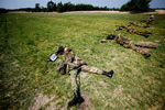
ARMED WITH HUMOURInvited by the Art Directors Club of the Netherlands (ADCN) to design their 2008 annual, they asked the Dutch army to shoot a bullet hole through each book. They wanted to suggest creative ‘targets' and at the same time take a shot at adland egos. |
He found the experience “exhilarating but exhausting”. Huge campaigns, a 300-strong creative team to look after, meetings about meetings, endless presentations and 24/7 partying formed the agenda for his demanding new lifestyle.
He described the type of work he was doing as “content-rich advertising for the YouTube generation. Kids today don't like things looking too slick, they prefer if it looks like something they could've made themselves in their bedroom.”
For the Gamekillers campaign for Axe (Lynx), they had to make the anti-perspirant appeal to 18-24 year old males trying to hook up with girls. They tapped into the universal truth that in the mating game there are forces working against young guys, people whose sole mission in life is to ruin a guy's chances.
A project that resonated strongly with the typographer in me was the product launch book Declan designed for Levi's Capital E premium brand. The jeans were shot against stark white in a landscape format. On the opening spread, the legs of each pair formed the negative space of the letter ‘E', the gatefold page revealed the rest of the product. Photography as typography and a design classic.
Garech's experience at 180 Amsterdam was just as hectic. “It's a young person's game, all right if you're in your 20s,” he revealed. His Adidas work was aimed at FCKs – Football Crazy Kids, with typography crafted for various territories, including Japan.
To underline the level of respect they have earned, the Stone Twins were recently appointed as the head of the Man and Communication department at the Design Academy Eindhoven, one of the world's most highly-rated design schools.
Conor Clarke (conor.clarke@designfactory.ie) is a director of Design Factory


